Showing posts with label nhl. Show all posts

Tuesday, 18 August 2015

xG Hexagonal Maps

First popularized by Kirk Goldsberry and then introduced to hockey via War-On-Ice's Hextally plots, hexagonal plots are a great tool for helping to visualize sports. I have created my own version's below in the form of apps. Two quick caveats, my current 2014/2015 data seems to have some bugs in it so take those seasons with a grain of salt and the individual attempts map also seems to be buggy for reasons currently unknown. I am working to fix both of those issues but just keep them in mind.

Here are some of the features of my xG Hexagonal Maps:

  • If you are unfamiliar with xG (Expected Goals) you can read my post detailing the methodology here. Simply, it provides the probability of any given shot resulting in a goal. 
    • A slight change between this xG and the one from that post is that these numbers also included missed shots now
  • The size of each hexagon is the frequency of shots from that specific location. The larger the hex, the more often a player shoots from that location
  • Each hex is coloured by the efficiency (xGe) of a player/team/goalie from that specific location.
    • Efficiency here is measured as the difference between how many goals we expected them to score from that location (their xG) and how many they actually scored from that danger zone.
    • A Blue Hex means that their xG was greater than their actual G, implying that they may have under-performed. 
    • Red Hex means that their xG was less than their actual G, implying that they may have over-preformed. 
  • Danger Zones are denoted by the light-pink and light-purple lines, high/medium/low. 
  • Not every red hex means a player over-preformed and not every blue hex means a player under-preformed. If you play in front of Henrik Lundqvist, your On-Ice Against xG is probably always going to be higher than your actually goals against. 
The links to all the different maps are posted below. Please let me know if you have any thoughts, questions, concerns, suggestions find anymore bugs . You can comment below or reach me via email me here: DTMAboutHeart@gmail.com or via Twitter here: @DTMAboutHeart  

Team Attempts Map

https://dtmaboutheart.shinyapps.io/app-1

Goalie Map

https://dtmaboutheart.shinyapps.io/Tendy

Player On-Ice Attempts Map

https://dtmaboutheart.shinyapps.io/PuckOn

Player Individual Attempts Map

https://dtmaboutheart.shinyapps.io/Single

Monday, 22 June 2015

Clustering NHL Forwards (using k-means)


How do you classify hockey players? Many would argue to go by the classical six positions (C, LW, RW, LD, RD, G) while some would argue for a rover (see picture above). I suggest a different distinction. Obviously, goalies are their own identity so they're excluded from this analysis. That leaves players which I will further breakdown into forwards and defence. Forwards and defence tend to have very distinct roles with a few exceptions (D.Byfuglien and B.Burns). In this post I am going to focus on forwards. It isn't easy to decide just which position a forward plays, don't bother asking the PHWA (see. the Ovechkin debacle) because they obviously can't tell. NHL.com is no help either since many of their positional declarations are hilarious out of place (ex. Zetterberg is listed as a LW despite taking over 1000 face-offs last season which places him 48th in the entire NHL). Then there is there is the issue of 1st/2nd/3rd/4th line. These roles are usually overstated by most media types and then there is a designation problem. If a player preforms like a 1st liner but his coach players him on the 2nd line? What really are they? I know, deep stuff. Long story short, breaking players down into categories is easier said than done.

K-Means Clustering

Therefore, I set out to with a fun exercise to reclassify forwards based on their playing characteristics. I used k-means clustering to break the players down into 8 categories based on these characteristics. I want to stress that these measurements are meant to reflect a player's playing style not how well or poorly they preformed. The chart below shows the average of each measurement broken down by cluster. I arbitrarily named the clusters myself, you shouldn't read too much into those. Come up with your own if you want. (You should click on that picture if you want to look at the cluster characteristics more carefully.)


Here is a random sample of ten players and which cluster they belong to. Please don't get too upset if you don't like a certain player's cluster. Remember these clusters group players by "playing style" not skill level. 

Cluster Features

Below are some box-and-whisker plots which breakdown the clusters by Corsi%, Age, TOI/GM  and AAV. Here is a quick run through of how to read a box-and-whisker plot:
  • The big solid line going down the whole graph is the mean value for the whole same. Example: The mean Corsi% for all forwards is 50%.
  • Within each box plot is another solid line that marks the median value for that cluster (the middle value of that cluster). Median not the mean.
  • The box itself encompasses the upper and lower quartiles of values, from the 25% to 75% percentile. 
  • The whiskers mark the top and bottom 25%, excluding outliers. 
  • Dots denote outliers.

Notes

  • All-Around, seems like the group a player would want to be in but it still encompasses a range of players from Sidney Crosby to Manny Malhotra.
  • "Safe" Depth is  labelled as such due to them being populated of lower end players (see. AAV), yet their Corsi compares favourably when compared to the Depth cluster of players.
  • High Impact players, do a bit of everything including areas that don't involves scoring ex. draw more penalties than they take while dishing more hits than they receive.
  • Power Forwards,  are big guys (yes, I subjectively looked at the cluster of players for 30 seconds and thought I saw a bunch of perceived power forwards) who prefer to pass more than they shoot but also take more penalties than they draw, probably due to a lack of foot speed.
  • Depth players, while few in numbers (only 13) they dish hits like crazy yet clearly trail in the Corsi%, TOI/GM and AAV categories. 
  • Passers, create a lot of opportunities for their teammates and are wizards at taking the puck away from their opponents more than they give it up.
  • Depth scorers, these are typically young players who have been held down in the lineup by their coach yet can really shoot the lights out.
  • Scoring Wingers, are very similar do depth scorers yet have been given a larger playing opportunity.
  • I would love to do the same exercise for defenceman but their doesn't seem to be enough distinction using my current attribute metrics. Maybe I will discover a better way to classify them in the future, who knows.
Please let me know if you have any thoughts or questions. You can comment below or reach me via email me here: DTMAboutHeart@gmail.com or via Twitter here: @DTMAboutHeart

Monday, 25 May 2015

Updated NHL Expected Goals Model


Here is the latest rendition of my Expected Goals model. If you haven't read the original post you probably should read it here before continuing.The only substantial change from the previous version is that this one now includes rush shots. As it has been previously shown that rush shots just by the very fact that they are rush shots result in a higher shooting percentage. My model currently only accounts for 5-on-5 situations and includes a total of five factors:
  • Adjusted Distance
    • The farther a shot the lower likelihood it results in a goal 
  • Type of Shot
    • Snap/Slap/Backhand/Wraparound/etc...
  • Rebound - Yes/No?
    • A rebound is defined as a shot taking place less than 4
  • Score Situation
    • Up a goal/down a goal/tied/etc…
  • Rush Shot - Yes/No?
    • Rush shots have a higher shooting percentage

Results

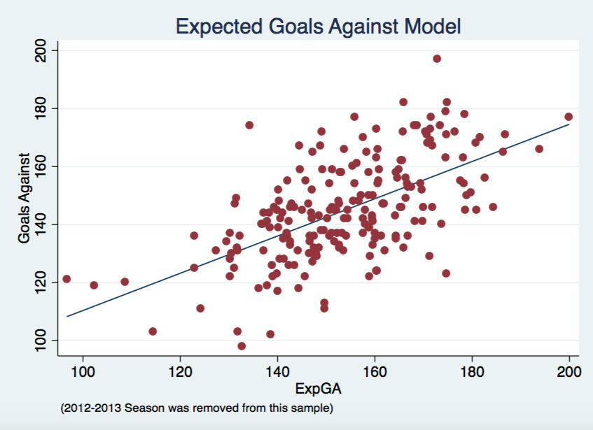
Same sort of graphs below as in the previous post, along with the correlations for each. The ExpGF correlation jumped slightly from 0.58 to 0.61 yet the ExpGA correlation stayed consistent at 0.60. That isn't to say adding rush shots didn't effect the model. There is definitely some difference both positive and negative on certain teams, typically within the 10 goal range.


Upcoming


I still plan on adding some aspect of regressed shooter and goaltender talent somehow into the model. I am close to releasing ExpG at the player level, hopefully within the next week. Around the time I am able to incorporate goaltender talent into the model I should also be able to update my xSV% with the shot quality aspects of this model.

Expected Goals


Here are the updated results below. Note that, dGF/dGA/dGF%, are calculated as actual minus expected. Therefore, a positive dGF means that a team scored more goals than the model predicted they would. A positive dGA means that a allowed more goals against than the model would have predicted. I will update this spreadsheet in its own tab at the top of this site too. Please let me know any questions or feedback you might have. Enjoy!


Thursday, 21 May 2015

NHL Expected Goals Model


Did anyone ever consider shot quality? 

UPDATE: This model has since been improved upon and shown here. This post still provides good background on the basics of the model.

Shot quality and possession metrics have always been somewhat a point of contention. Expected Goals (ExpG) helps to combine these two facets in hopes of providing better information about the game. Expected Goals are not a novel concept, ones have been presented previously by Brian Macdonald for hockey and the original motivation for my study by Michael Caley's soccer version. I hope to lay out my ExpG model in a way that makes hockey sense, where everyone can understand why each factor was added into the model. The model works by assigning a value to each shot taken over the course of a season based on the model's predicted probability of that shot resulting in a goal. To calculate a team's final ExpG all you have to do is sum up all of these probabilities and there you have it. First I will breakdown the methodology that goes into this model. If you don't care and just want to see the results skip down to the Expected Goals section or check out the Expected Goals tab above.

Methodology


My model uses a logistic regression to arrive at each goal probability. Basically, it uses a bunch of independent variables to produce the odds of binary outcome occurring, in our case, yes a goal was scored or no a goal wasn't scored. I reran the logistic regression for each season instead of using one big logistic regression. So far my model only accounts for 5-on-5 situations. This helps to account for minor changes in style of league play yet the regression coefficients didn't actually change much year-to-year. Here are the factors taken into account by the model:
  • Adjusted Distance
    • The farther a shot the lower likelihood it results in a goal 
  • Type of Shot
    • Snap/Slap/Backhand/Wraparound/etc...
  • Rebound - Yes/No?
    • A rebound is defined as a shot taking place less than 4
  • Score Situation
    • Up a goal/down a goal/tied/etc…


Results


In the two graphs below you can see how well ExpG, both offensively and defensively, correlates with actual results. Each point represents one team from one season, except 2012-2013 was removed due to the lockout. 


There will always be some outliers in a given season but I think the model goes a relatively good job. The chart below shows that ExpG comes out on top when compared to Corsi and Scoring Chances in terms of correlation to real goals for and against in a given season.


Goals For Goals Against
ExpG 0.58 0.6
Corsi 0.493 0.57
Scoring Chances 0.53 0.562

Future Work


In the next coming weeks I will be focusing my efforts on two different aspects of this model. Firstly, I will investigate how well it predicts future goals, from one season to the next as well as something similar to Micah Blake McCurdy did with score-adjusted Corsi. Secondly, I will be looking at other factors to add into the model. I plan on adding rush shots as a factor, though the current state of my data will require some tweaking before I can do that. I also plan on exploring the effects of incorporating shooter talent and goaltender talent. I also plan on releasing ExpG at the player level and use aspects of this model to better xSV%. 

Expected Goals


I just wanted to thank War-On-Ice and Sam Ventura for the data used in this project. Finally, here are the results below. Note that, dGF/dGA/dGF%, are calculated as actual minus expected. I will give this spreadsheet its own tab at the top of this site too. Please let me know any questions or feedback you might have. Enjoy!


Tuesday, 31 March 2015

xSV% - Team Data


After my original post looking at xSV% exclusively at the individual goalie level I received a few requests to look at the same data but at the team level. Simple enough and presented below is xSV% team data from 2002-2014. If you didn't read my original post on xSV% you can do so here, but I am also going to follow up and reiterate what exactly xSV% entails.

What xSV% is:

  • Expected Save Percentage based on a 110 game moving average of the opposing shooter at the time of each shot faced by a goalie
  • Better players typically have a higher shooting percentage, therefore if a team limits their opponent's best players from shooting the puck, they will raise their own ExpSV%
  • Forwards typically have a higher shooting percentage, if a team can limit the amount of shots taken by an opposing teams forwards and instead force them to rely on their defenceman to generate shots, they will raise their own ExpSV%
  • ExpSV% is highly influenced by era. As shown in the graph below representing the league average Expected Save Percentage for each season with the lockout lost season shown by the red line, scoring has been down in recent years since the lockout.
  • This era influence is the big reason why the 110 game moving average is necessary. Simply using a single season worth of data can sometimes not be enough. Likewise, using a player's career average shooting percentage can provide misleading results.
    • For example, the ever great Jaromir Jagr has a career shooting percentage of 13.7% that is heavily influenced by his earlier playing days. Jagr hasn't had a season of shooting that efficiently since 2005-2006. Therefore a rolling average helps more accurately depict his current conversion ability. 

What xSV% is not:

  • An all encompassing, all-knowing stat that gives the exact Expected Save Percentage for each team
  • A definitive ranking of how well teams manage to play defence

Results

Below is all the team level data. Play around with it and please send me any feedback/questions you might have. Enjoy!


Wednesday, 21 January 2015

Why Some Older Players Decline and Some Don't


"Father time is undefeated" 

Sports are a continuous cycle of torch passing from the old to the young, veterans to rookies. The living embodiment of turning back the clock in the NHL is none other than Jarmoir Jagr. The 42 year old Czech seems to defy all odds and assumptions of how a hockey player is supposed to age. The average player typically peaks around their age 24 season and than can expect to either be out of the league or a major hinderance on their team's performance by about 35. Jagr however has altered his own game to still be an effective player in these later years even when his body won't allow him to play the same style he did in his prime.

Typically in a player's later years they seem to fall into two categories, those who simply aren't good enough to stick in the league and the stars who seem to never age (see. Jagr, Chelios, etc...) This brings me back to considering why some players, and even previous superstars, age more gracefully than others.

I have developed a few test case to in hopes of discovering some noticeable trends. Now let's look at the four subjects I settled on for this test case. All of these are currently older players but I chose two that many would say have aged well (Jaromir Jagr and Joe Thornton) versus two players that have not aged so gracefully (Vincent Lecavalier and Dany Heatley).

Possession


I decided to use dCorsi in this analysis to look at a player's contributions to possession. For those unfamiliar with the stat, they can read up on it more here. It is probably the most accessible and peer reviewed context neutral possession metric available. I prefer to use it in circumstances like this when we are comparing multiple players across various teams and seasons.

Below is a dCorsi aging curve. As you can see there is no clear pattern here that would dictate to us that a player's age has an effect on their dCorsi rating. This actually makes intuitive sense when you consider that dCorsi itself is designed to account for a player's age in the calculation. Also, the age coefficients aren't substantially big when compared to the other regression coefficients so I wouldn't read too much into the dCorsi taking age into account.

Now for the test case subjects, from the graph below you can see that a player's possession skills do not tend to vary with age. Thornton and Jagr have always been above average to great possession players where as Heatley and Lecavalier have more or less never been able to hold their heads above water. (***Remember that Jagr didn't play in the NHL between his age 35 and 39 seasons, so try to ignore that line there).

Production


Next I am going to dive into player production. Each of these player's at one point in their career were excellent goal scorers (save Thornton whose has always identified as more of an elite playmaker). So instead of simply just looking at goals scored I broke it down into two lesser components, how many shots a player takes and what percentage of those end up in the back of the net. 

Below is an aging curve for a player's shooting percentage (try to ignore the tails as I think thats simply just a mistake on my part rather than any relevant information). This aging curve looks very similar to that of dCorsi in the sense that we see little to no evidence of age having a significant effect on shooting percentage. 


Once again lets see if anything can be gleaned from the aging curve and applied to our test subjects. There seems to be a lot of minor variance from season to season but still no real identifiable trend. Thornton and Heatley seem to have shown minor signs of aging but when you consider that they both still convert shots at a higher than rate than NHL average it is hard to argue that age has severely hindered their ability to efficiently convert shots into goals at an effective rate. 
"You miss 100% of the shots you don't take" - Wayne Gretzky

When it comes to goal production the other half of the equation is shot quantity. Typically the more shots a player takes the more goals they score. The aging curve for shots per game really starts to show us the extent that age can have on a player. You can see that a player's shot rate peaks around their age 24 season and then only proceeds to get worse after that.

Some of you might be wondering why shots per game produces such a nice curve when a player could theoretically buck the system by just firing shots to the net at will. That simply isn't practical in a real world sense. While it possible that a player might just fire shots at random, no player simply takes a shot just to take it. Every shot is taken with a specific purpose in mind whether that is to try and score, create a rebound or simply get an offensive zone face-off. Therefore as a player's individual shots decreases we tend to see their specific role and ability to positively contribute to their team's offensive begin to decline.

The controlled study below shows essentially exactly what we would expect to see based on the aging curve above. Each player's individual shooting shows a significant drop off with age. Previous snipers Heatley and Lecavalier see their shot rates plummet. Jagr's rates are not what they were when he was younger and have actually gotten better in recent years which explains his continued ability to contribute positively. Thornton is an interesting case since he has never truly been a shooter at any point in his career, therefore contributions come from his elite playmaking which helps explains his always low shooting rate.

Finally we will look at assists to see how much we can attribute each player's drop off to that of losing a playmaking edge. There seems to be a steady declining pattern here which would make sense considering the rule that player's tend to get worse as they get older. The drop however doesn't appear as drastic as that shown in the Shots/G graph with the aging process having less drastic effect with regards to assists. We also get to see where Joe Thornton retains much of his production value, compared to the rest of the group. 

Conclusion

Projecting player performance is never easy but from this exercise some helpful insights might be gleaned.
  1. Player's possession abilities don't tend to vary much with age. It is the skill that seems to age the best.
  2. Goal scoring will suffer fairly drastically with age.
  3. Assists will age better than goals but still not great. 
Therefore, when signing older forwards it is imperative that their ability to control the ice regardless of their production rates must be taken into account. Possession seems to age the most gracefully and will provide a team with most value once their production seems to run dry. This ideology looks favourably on a player like Marian Hossa who has continuously put up dynamite possession numbers. I would however, preach wariness on an aging player like Martin St. Louis who has never truly been a possession star and sees most of his value come from high production numbers that we should expect to decline sooner rather than later.


Sunday, 14 December 2014

How Long Does It Take For A Forward's Shooting To Stabilize?


If a player scores one goal on five shots, does that mean they are suddenly a 20% shooter? What if it is 10 goals on 50 shots? How about 20 goals on 100 shots? This is a classic issue of sample size in trying to separate the signal (talent) from the noise (randomness). That issue being, how big does a sample need to be before it stops being small? The question has been tackled before in other sports, see baseball here and basketball here, and my analysis here will mirror a lot of the methodology laid out in those pieces. 

Relating the problem to a player's shooting talent, how many shots does a player need to take before we can separate the talent from the randomness?

Now if you don't care about the math then please skip to the *** for the answer and analysis. 

Otherwise lets dive in!

The most common method used for testing this problem is typically split-half reliability testing. For example, if we were wondering how stable a player's shooting percentage is after 100 shots we would label each shot from 1-100 and then randomly split these 100 shots into two random 50 shot samples. We would then compare the player's shooting percentage between these two samples. This method is fine but it can be improved upon in our case by using the Kuder-Richardson Formula 21 (KR-21).

This formula will tell us the reliability of a test involving binary outcomes (two results), which is great for this test since when a player takes a shot there are only two possible results, a save or a goal. The KR-21 formula allows us to perform a split half reliability test but instead of only being able to compare one only type of combination it allows us to compare every single possible combination of these outcomes. For example, if we were going to preform a basic split half reliability test for a total sample of 10 shots (each labelled, 1 2 3 4 5 6 7 8 9 10) a simple method would be to compare all the even number shots with the odd number shots. Using the KR-21 formula however goes further and compares every single type of combination (ex. evens vs. odds, 1-5 vs. 6-10, 1 2 3 9 10 vs. 4 5 6 7 9, etc..). The results of this 10 shot KR-21 test will be a much better estimate of how reliable an indicator of a player's true talent level a stat will be over a 5 shot sample (10 divided by 2 = 5). 

Our goal is to reach a reliability of 0.707 at which point the signal (skill/talent) will begin to overtake the noise (randomness/luck) in our sample (0.707 x 0.707 = 50%). Below I have charted shots versus their reliability to show how the reliability of a sample which change as your sample's cutoff point increases. The blue line shows the logarithmic curve of reliability (which had an R-squared fit of 0.99626 with the data points) which I used instead of simply plotting a basic curve graph. I used the log curve because as you might notice in the table below I got a tad lazy and stopped running the numbers as frequently for bigger samples so I used the logarithmic curve which shows the relationship just as well. The red line shows the 0.707 cut off line where talent beings to overtake the randomness. Above the red line = good, below the red line = not good.


***


I found that after about 223 shots the reliability will cross the 0.707 threshold.


Shots Reliability Signal (Talent) Noise (Luck)
25 0.169 2.8% 97.2%
50 0.317 10.0% 90.0%
75 0.410 16.8% 83.2%
100 0.493 24.3% 75.7%
125 0.560 31.4% 68.6%
150 0.604 36.5% 63.5%
175 0.656 43.0% 57.0%
200 0.677 45.9% 54.1%
212.5 0.693 48.0% 52.0%
217.5 0.704 49.5% 50.5%
222.5 0.707 50.0% 50.0%
225 0.712 50.6% 49.4%
250 0.732 53.6% 46.4%
300 0.765 58.5% 41.5%
375 0.805 64.9% 35.1%
500 0.891 79.5% 20.5%

We now know that at 223 shots a player's shooting percentage is about 50% skill and 50% luck, which is still a lot of noise. We have to get about 400 shots before we really see a player's talent begin to shine through. This once again demonstrates how easy it is to be fooled by small sample sizes. While 223 may seem like a reasonable estimate it should be noted that only 40 players last season (2013-2014), or just over 6% of the entire league, record more than 223 shots. Alexander Ovechkin led the league with 386 shots total (along with a 13.6 shooting percentage) and still only gives us a signal strength of about 65%. 

This isn't meant to be predictive necessarily. That is to say, just because John shot 9% over 223 shots doesn't mean that we should expect John to shot 9% over his next 223 shots. If John shoots 17% over his next 50 games did he suddenly become a better shooter? Probably not. However, if John shoots 12% over his next 223 shots, the case can actually be made that this player may have improved his actual shooting talent. 

This all goes to show that it does take quite a bit of time for a player's shooting percentage to stabilize. Many are quick to reach assumptions about a player's actual ability simply based on a single season which we can see here rarely makes sense when the vast majority of the league will have taken so few shots that separating the signal from the noise is incredibly difficult. There is definitely talent at the heart of a player's ability to score goals, it just takes some time for that talent to truly become evident.


Thursday, 27 November 2014

Corsi Against Doesn't Correlate with Save Percentage


How does a goalie's workload affect their ability to preform?  This question always seems to be bouncing around  and recently has come up again with regards to whether a goalie's workload (the amount of Corsi events they face) has a tangible impact on their save percentage.


Previous Literature 


The first analysis was done by Brodeur Is a Fraud and found little to no evidence of a correlation between the two variables. Another look was done over at Hockey-Graphs and found similar results with a different method:
For the forty active goaltenders to play at least one hundred NHL games over the past four seasons, there is no substantial relationship in them playing better -in terms of save percentage- when facing more or less shots against.
Chris Boyle in his own study at SportsNet did seemed to find a quite strong relationship yet I have some serious doubts as to the validity of his methodology. Essentially by looking at the raw shot counts and save percentages posted in individual games while removing goalies who didn't play the full game you result a very serious issue of survivor bias. Why do goalies in this study who see a large amount of shots against only post high save percentages? Most likely it is because if a goalie faces a large number of shots and doesn't post a high save percentage they will allow a large number of goals which leads to them being pulled from the game and therefore they are removed from this study. This removal doesn't happen for goalies who face a low number of shots while posting a low save percentage because they can still allow only a low number of goals against giving their coach no incentive to pull them. Example, a goalie faces 20 shots against and lets 2 in. That's a .900 save percentage which in the big picture isn't good but in an individual game only allowing two goals against is just fine. Therein lies my issues with this study.

Finally, we arrive at the most recent post by David Johnson at Hockey Analysis who can summarize his own methods best:
In my opinion, the proper way to answer the question of whether shot volume leads to higher save percentages is to look at how individual goalies save percentages have varied from year to year in relation to how their CA60 has varied from year to year. To do this I looked at the past 7 seasons of data and selected all goalie seasons where the goalie played at least 1500 minutes of 5v5 ice time. I then selected all goalies who have had at least 5 such seasons. There were 23 such goalies. I then took their 5-7 years worth of CA60 and save % stats and calculated a correlation between them. 
Basically, he found the individual correlations for each goaltender and then averaged these individual correlations. A few issues I noticed starting with the fact that correlation coefficients aren't additive. You need to first convert them to Fischer z values which are additive. This issue is minor as I ran his test again the results don't alter too much with this adjustment.

The second issue I take is with the claims made based on this study. Starting the use of word "boost" in the title implying that there is not only causation here which I am not convinced of (we simply see a correlation via his methodology) and also that there is only a positive correlation, meaning that an increase in CA/60 results in an increase in SV%.  Examine the data closer you find that 8/23 goalies saw the inverse effect (more shot-attempts against lowered their SV%) while another two saw essentially zero change in SV% in relation to their shot-attempts faced. This leaves us with only 13 goalies who we can see to have a positive correlation. This leads to my issue with the author making a general assumption about the impact of CA/60 boosting Save Percentage as a uniform result that can be applied across the board to all goalies, when he is really only talking about a specific subgroup. Later on in this post I will reveal my doubts with regard to his methods and how I believe he simply found a false positive for a relationship that doesn't exist. 

My Findings


I tweeted this graph out earlier when this question was first raised on Twitter. It is a very basic graph that took me a few minutes to put together but you can see a team allowing more shot-attempts against having a noticeable impact on their save percentage to be essentially zero.


These next few charts look at the individual goalie level. I set different cut offs in each graph just to see if we could weed out some goalie talent since better goalies tend to play the more minutes (unless your team is located in Winnipeg) and we still aren't able to find any strong evidence (the correlation does actually increase as we narrow the sample jumping from about 0 to 3%). 


This graph below is the same as the ones above but only using the data included in the Hockey Analysis study.


Since none of the graphs I managed to produce were able to find any correlation I decided to try my own blind recreation of the method used at Hockey Analysis. Below are two graphs very similar to the graphs first produced at Hockey Analysis that seemed to demonstrate the correlation between CA/60 and SV%. I have removed the titles of these two to add an element of surprise. Take a quick look at both before finding their titles below. 


***

***

***

 Surprised? This is my basic way to suggest that the results shown in Hockey Analysis' study could be the result of simple random variation. Pekka Rinne's chart is to show how one of these samples can be pretty much out of wack on the individual level while the Niemi vs. Howard chart shows that even when picking two variables that we know for a fact should have zero correlation to each other, when dealing with such small samples in this case only 5 seasons (or data points), it can be pretty easy to discover a relationship that doesn't actually exist.

The chart below shows the data on the correlation's found by Hockey Analysis. I took the liberty of converting it to Fisher z-values and then the Inverse of that which is the real correlation that he was looking for. So in actuality his correlation was higher than he first reported. To make things simpler I have stared* the important column here with the true correlation. 

Average Correlation Average Fisher Average Fisher Inverse*
0.183 0.215 0.212


The issue as you may have seen above in the Niemi vs. Howard chart is that it is very easy with this data set and this method to find correlation's that we know for a fact shouldn't exist. Below I calculated 23 correlations and their subsequent Fisher values in my blind test. I simply put the goalies in alphabetical order and compared the CA/60 for goalie A with the SV% of goalie B. 


Correlation Fisher
-0.292 -0.301
0.098 0.098
-0.098 -0.098
0.730 0.930
0.631 0.743
-0.407 -0.432
-0.726 -0.919
0.116 0.117
0.536 0.599
0.117 0.118
0.126 0.127
-0.230 -0.234
-0.131 -0.132
0.338 0.351
0.586 0.671
0.468 0.507
-0.631 -0.744
-0.383 -0.403
-0.616 -0.718
-0.708 -0.882
-0.213 -0.217
-0.095 -0.095
Average Average Fisher
-0.784 -0.916
Fisher Inverse*
-0.724

We know from common sense and logic that the number of shot-attempts faced by Evgeni Nabokov will have no effect on Henrik Lundqvist's save percentage but the number's actually show a correlation (.73). This is obviously a false positive showing a correlation that doesn't truly exist. Simply stated, correlation doesn't always prove causation. Based on what I have found here and the earlier research done on the subject, I feel confident in stating there is still little to no evidence relating the Corsi Against a goaltender and their Save Percentage.


You can reach me via email me here: DTMAboutHeart@gmail.com or via Twitter here: @DTMAboutHeart


Tuesday, 11 November 2014

NHL Draft Pick Value Chart


Drafts have always been a mystery in the sporting world. The number of teams relying on the draft to build their teams continues to rise in an era of delicate salary caps and bigger, stronger, faster athletes. Evaluating and projecting young athletes is far from an exact science to say the least. Look back at the 2007 NHL Entry Draft when the Pittsburgh Penguins selected Angelo Esposito 20th overall while the Dallas Stars were able to pick up future captain Jamie Benn with the 129th pick in the 5th round. In hindsight the mistake's seem obvious but this is hardly the standard, as you can see in the graph below earlier picks tend to yield much higher success rates than later selections.


Goalie's as it has been well documented in the past, are slightly less predictable to say the least...


What is each draft slot worth however? Attempting to nail down the value of a draft slot in the NHL has been attempted many, many, many, many, many, many times. I decided that it was time to reevaluate the idea from a slightly different approach than most.

In order to come up with my values, I gathered each draft pick going back to 1970 (when the draft really started to resemble what it is today) and looked at each player's Point Shares only during their first seven seasons in the NHL. I fully recognize that catch-all statistics are not perfect evaluations of a player but they are probably the best available statistics for judging large numbers of players throughout history. I chose Point Shares over GVT mainly because Point Shares cannot be negative, GVT on the other hand can be negative which causes difficulties when comparing certain players. Example, how do you value a player who makes the NHL and records a negative GVT against a player who never played an NHL game and therefore has a zero GVT? Should that player be counted less even though many would argue they were probably a better hockey player? It is a tough question but thankfully Point Shares doesn't share this issue.

Looking at only a player's first seven years rather than a players full career accounts for the assumption that when a team selects a player in the draft they are only guaranteed at most 7 years of that player's services before they hit free agency (3 years from their rookie contract and then 4 years of their RFA rights). I then fitted this data with a logarithmic curve to smooth the data to show the sharp drop off in value from the first picks followed then a more gradual drop for the later picks.

In the future I hope to replicate and build on Eric T.'s work found here regarding the market value of a draft pick. Where as my values were based on draft results, Eric based his on the market rate as determined by team trades. Comparing the two methods could provide some insight into what spots in the draft might be over or undervalued by teams relative to their actual expected value.

Below is the grid for comparing the individual value of each pick. Reminder that these value's are arbitrary numbers and should only be used to compare draft slots and not any players involved in a potential trade. This once again is an approximation many years of data and in no way a hard rule of how every pick should be valued. Enjoy!


You can reach me via email me here: DTMAboutHeart@gmail.com or via Twitter here: @DTMAboutHeart

Wednesday, 5 November 2014

Normalized Career Player Stats


Who is the greatest goal-scorer of all-time? What about playmaker? Hockey like all sports has evolved so much over the years that it is extremely hard to compare individuals in different eras. With the help of Rob Vollman's database and Hockey-Reference's Normalized Data I have compared the career's of every player over the past 47 years (since the 1967 expansion) to help shed some more light on these debates.

The Normalized Data is presented just like any player stats except all the stats are scaled to reflect certain changes throughout the league's history. The most common adjustments are to account for different lengths of schedules, amount of players carried on each roster and era adjustment to account for the amount of goals being regularly scored in those games (ex. it was easier to score a goal in 1981 than it is in 2014).

You can filter and sort this table at your own discretion and pleasure, enjoy!


*Players needed at least 300 Games Played by the end of the 2013-2014 season to qualify
**Even if a player's career began before 1967 this chart will only reflect their stats since 1967

Observations

  • The data is obviously skewed towards players whose careers have yet to end. It is extremely hard to maintain high levels of play throughout your entire career which is why active players still in or near their primes will see their stats slightly inflated. 
  • Bobby Orr was amazing. He absolutely dominated the game from an offensive stand point that we will probably never see again. 
  • Sidney Crosby is the greatest player alive and one of the best ever.
  • Ovechkin is probably one of the greatest goal scorers to ever lace up the skates. It still amazes me how much garbage is thrown Ovechkin's way by people who have a seriously flawed understanding of the game of hockey or are simply trying grab a headline. Ovechkin is one of, if not the most, lethal goal scorer in the leagues past half-century and we should all just appreciate the opportunity to bear-witness. 
  • Kovalchuk's stats will forever be skewed from the fact that he essentially played out his best years in the NHL before bolting to the KHL which essentially ensures that his career rate stats will never suffer as he ages. He did have a great run though, while it lasted. 
  • Lemieux and Gretzky come down to the wire here. Lemieux has the better era-adjusted PTS/Game due to his big years occurring in the 90s as opposed to Gretzky who succeeded in the high flying 80s. Gretzky however, played about 500 more games which has to be considered as a positive when considering the two.
  • Jagr is ageless. He keeps on clicking at a ridiculous rate despite taking 3 years off to play in Europe only to come back and put up unheard of numbers for a player older than 40.
  • Cam Janssen just nudges out Colton Orr for worst PTS/Game of any regular forward in the last half decade. Likewise, Wade Belak takes home the title of least offensive defenceman of the modern era.

Friday, 3 October 2014

Maggie Projections 2014-2015


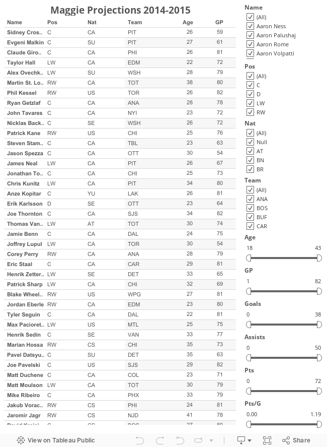
The start of the new NHL season is right around the corner and with that I present my first instalment of the Maggie Projections for the 2014-2015 season. Essentially these are projections for the the upcoming NHL season based on the system developed by Tom Tango for baseball about a decade ago.
It is the most basic forecasting system you can have, that uses as little intelligence as possible. So, that's the allusion to the monkey. It uses 3 years of MLB data, with the most recent data weighted heavier. It regresses towards the mean. And it has an age factor.
Tango named his system Marcel after Marcel the monkey due to the idea that they're so basic a monkey could do them. In order to avoid any potential confusion and add a little hockey flavour and have affectionately named these projections after Maggie the Monkey. A quick history lesson for those who may not know, Maggie the Monkey was a reoccurring guest on TSN during the playoffs in which she would spin a giant wheel to predict playoff rounds. I think it was a brilliant display of the randomness of hockey and the unpredictability of the small sample tournament Stanley Cup Playoffs. Her record was pretty impressive all things considered, (I must remind you, it's a monkey spinning a giant wheel) she was 50% on her career and 53.33% before her tough last season.

I may look to try and improve on these projections at a later date by adding on new stats and adjusting the projections with some tweaks here and there. Reminder, I do not stand behind these forecasts as this is essentially one big formula that I have taken and applied to hockey with no subjective input from me at all. (Credit to Rob Vollman's player spreadsheets for my data)
To save people some time, please use the following format for all complaints:
<player> is clearly ranked <too high/too low> because <reason unrelated to Maggie Projection system>. <subjective ranking system> is way better than this. <unrelated player-supporting or -denigrating comment, preferably with poor spelling and/or chat-acceptable spelling>

So without further ado, here are the Maggie Projections for the 2014-2015 season.